In the realm of marketing analytics, modern visualization techniques have become increasingly popular. These techniques simplify complex data sets and make them more accessible to a broader audience. Marketing analytics heavily relies on visualizations for several reasons. Firstly, visualizations enable marketers to analyze and interpret large amounts of data more effectively. They visually represent complex data sets, making it easier to identify patterns, trends, and relationships (Didimo et al., 2020). This is particularly valuable in the era of big data, where marketers have access to vast amounts of information (Asokan et al., 2019).
Moreover, visualizations help marketers clearly and concisely communicate their findings and insights to stakeholders (Lavalle et al., 2021). They can be used to create compelling and persuasive presentations, reports, and dashboards that facilitate decision-making (Gioti et al., 2018). Marketers can effectively convey complex information to non-technical stakeholders, such as executives and clients, by presenting data visually appealingly. In addition, visualizations enable marketers to understand consumer behavior and preferences better. By analyzing visual data, such as images and social media posts, marketers can uncover insights that may not be obtainable through other methods (Dzyabura et al., 2021). This can help marketers tailor their marketing strategies better to meet the needs and preferences of their target audience.
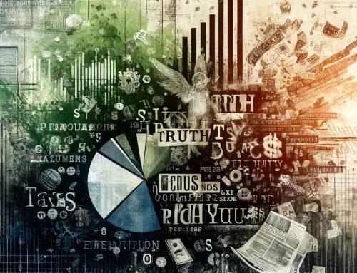
Some of the most commonly used visualization techniques in marketing analytics include heat maps, funnel charts, choropleth maps, tree maps, network diagrams, word clouds, dashboards, Sankey diagrams, radar charts, and box and whisker plots. Heat maps are handy for representing complex data sets in a visually accessible format. They use color-coding to represent different values and can be used to show user engagement on a website or app, or to display geographically based data. Funnel charts, on the other hand, represent the conversion process in stages, from initial customer awareness to the final purchase decision. The narrowing shape of the funnel signifies the decreasing number of potential customers at each stage.
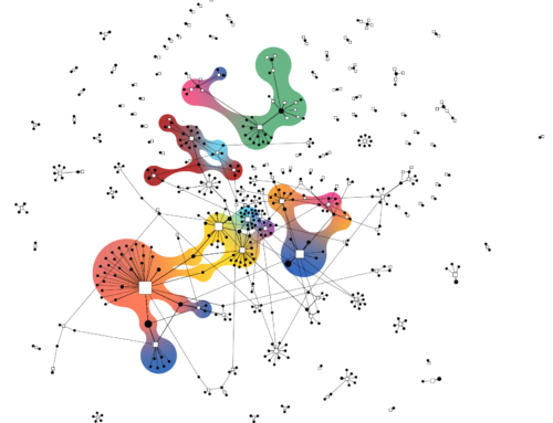
Choropleth maps are ideal for displaying geographical variation in data, such as the distribution of a product’s sales by region or country. Tree maps are used for hierarchical data and part-to-whole relationships, while network diagrams visualize complex relationships between various elements. Word clouds highlight the most used words in a dataset, while dashboards provide an at-a-glance view of key marketing metrics.
Sankey diagrams can be used to visualize users’ flow through a website or represent customer journeys, as you can see here. Radar charts display multivariate observations with an arbitrary number of variables, while box and whisker plots help compare different categories and understand variations within a dataset.
In conclusion, simplicity and clarity are essential to effective data visualization in marketing analytics. These tools simplify complex data and make it easier to understand, so choosing the visualization technique that best conveys the information you’re trying to present is essential. Overall, visualizations play a crucial role in enhancing the effectiveness and efficiency of marketing analytics. They enable marketers to analyze and interpret large amounts of data more effectively, communicate their findings and insights to stakeholders clearly and concisely, and gain a deeper understanding of consumer behavior and preferences. Visualizations are essential for any marketer looking to succeed in today’s data-driven business environment.
References:
Asokan, V., Yarime, M., Onuki, M. (2019). A Review Of Data-intensive Approaches For Sustainability: Methodology, Epistemology, Normativity, and Ontology. Sustain Sci, 3(15), 955-974. https://doi.org/10.1007/s11625-019-00759-9
Didimo, W., Grilli, L., Liotta, G., Menconi, L., Montecchiani, F., Pagliuca, D. (2020). Combining Network Visualization and Data Mining For Tax Risk Assessment. IEEE Access, (8), 16073-16086. https://doi.org/10.1109/access.2020.2967974
Dzyabura, D., Kihal, S., Peres, R. (2021). Image Analytics In Marketing., 665-692. https://doi.org/10.1007/978-3-319-57413-4_38
Gioti, H., Ponis, S., Panayiotou, N. (2018). Social Business Intelligence: Review and Research Directions. JISIB, 2(8). https://doi.org/10.37380/jisib.v8i2.320
Lavalle, A., Maté, A., Trujillo, J., Teruel, M., Rizzi, S. (2021). A Methodology To Automatically Translate User Requirements Into Visualizations: Experimental Validation. Information and Software Technology, (136), 106592. https://doi.org/10.1016/j.infsof.2021.106592